Showing posts with label cover lust. Show all posts

Tuesday, July 17, 2012

Cover Lust (35)

This installment of Cover Lust has kind of an, um, unintentional theme to it. What do you think of this style?

Imperfect Bliss by Susan Fales-Hill
(Atria / July 3, 2012)

I'm loving this "modern frieze"-esque style. It's contemporary while evoking a timeless style of art that speaks well for its designer and the contents of the book.

City of a Thousand Dolls by Miriam Forster
(Harper Children's / Feb. 5, 2013)

Talk about a book cover of epic movie poster proportions! I want this hanging up on the walls of malls, cinemas, Times Square... And on top of being epic, the colors are also bright and glowing.
Lovely, Dark and Deep by Amy McNamara
(Simon & Schuster / Nov. 13, 2012)

This is collector's-edition postcard-worthy. I love the colors and the positioning of the title. And you probably can't see it, but there is a white border around the image, which adds to its collector's-edition image feel. I swoon!

(Candlewick / July 10, 2012)

This eye-catching cover evokes the art of paper-cutting and is a lingering mix of art deco and gothic. Is it rewarding to look at? I should say so!

Tell the Wolves I'm Home: A Novel by Carol Rifka Brunt
(Dial Press / June 19, 2012)

Oh my, this reminds me of those embroidered book covers that have been slowly but surely winning over hearts everywhere. How cool is this cover??!

-

So, what's your verdict? Which of these fits your style the most?

Thursday, May 31, 2012

Cover Lust (34)

It's been a while since I've done a Cover Lust post! Mainly because a lot of covers I've been encountering have inspired in me the opposite of lustful feelings. (But that is another post for another day...) At long last, however, I have found several covers that I quite like.

Let The Sky Fall by Shannon Messenger
(Simon Pulse / March 2013)

You can kind of get a Mara Dyer cover vibe from this one. There's something about the combination of that eerie storm-orange tone and the centered alignment of the words and people that draws my eye to it. What do you guys think?

Son by Lois Lowry
(Houghton Mifflin Harcourt / Oct. 2, 2012)

Simple in terms of color scheme, but oh, the texture!

Eve and Adam by Katherine Applegate and Michael Grant
(Feiwel & Friends / Oct. 2, 2012)

I'm finding it hard to explain why I like this one. Maybe it's their way of "modernizing"/"computerizing" the symbolic apple. Maybe it's the almost painful color saturation. There's just something about it that makes me nod approvingly. ('Course, 10 to 1 says the publisher will change the cover for the paperback, as this one is so different from what else is out there. But we'll cross that bridge when we get to it.)

The Snow Child by Eowyn Ivey
(Little, Brown / Feb. 1, 2012)

Wow, paper cutouts (or at least the impression of that style)... it makes me feel all tingly inside.

Black City by Elizabeth Richards
(G. P. Putnam's Sons / Nov. 13, 2012)

Again, I'm undecided as to whether or not I really like it, but I appreciate all the attentiveness that must have gone into arranging for that rose to shatter into all those pieces. I think the color scheme and the simple but bold fond choice and placement are alluring as well.

Ironskin by Tina Connolly
(Tor Books / Oct. 2, 2012)

I swear, my heart skipped a beat when I laid eyes upon this cover. Oh my wordless. Oh my. Oh my. Oh my. There's nothing about this cover that I do not drool over. That awesome silvery dress. The swirly smoke. The gloomy background. Even the color of the simply-fonted title, complementing the rest of the cover yet standing out at the same time. It gets even better when you know what the book is about... which is why I highly encourage you to click the Goodreads link and go find out more about it.
-

Which of these is your favorite? What covers have you seen recently that you like a lot?

Saturday, January 14, 2012

Cover Lust (33)

Enchanted by Alethea Kontis
(Harcourt / May 8, 2012)

What a lush, colorful, and evocative cover this fairy tale retelling has! I think my favorite part might be the shockingly pink flowers near the top: little splashes of spirit-lifting color.

The Selection by Kiera Cass
(HarperTeen / April 24, 2012)

I feel like there's been more and more a trend of full-bodied (or at least not faceless) girls in pretty dresses on YA speculative fiction covers recently. I'm not sure how I feel about this girl's dress, but I love the funhouse-mirror-esque effect going on behind her! This cover is so shimmery and alluring.

Vessel by Sarah Beth Durst
(Margaret K. McElderry / Sept. 11, 2012)

Am I... is that... can I believe my eyes? Is that really a strong and beautiful POC female on the cover?!?! Wow. Wow wow wow. I love the lighting, and the smoke, and the translucency of the title, and of course I love that model, a thousand times over. Be still, my trembling heart. (But really, on the inside I'm screaming, "I want this in poster size on my wall!!!!")

The Jade Notebook by Laura Resau
(Delacorte / Feb. 14, 2012)

This cover makes me yearn for bikini weather, warm waters, and sunshine. That is all.

Exile by Rebecca Lim
(HarperCollins Australia / May 28, 2011)

Muse by Rebecca Lim
(HarperCollins Australia / Oct. 27, 2011)

Books about angels always get such pretty covers.

-

Which of the above covers is your favorite? Have you seen any covers lately that you're lusting over and that you want to share?

Monday, October 17, 2011

Cover Lust (32)

Bitterblue by Kristin Cashore
(Dial / May 1, 2012)

I think this one deserves an AT LONG FREAKING LAST. But the wait will be sooooo worth it. Kristin Cashore is one of those rare authors who get better and better with each book, and I don't care how long she needs to write each of her books, I will wait patiently. I'm so happy that Bitterblue got such a gorgeous cover too. The style matches the covers for Graceling and Fire, but the keys just... wow! They really pop. Reading this article on Cashore in last week's edition of Publisher's Weekly's Children's Bookshelf email made me all the more excited for May 2012.

Destined by Jessie Harrell
(Mae Day Publishing / Nov. 17, 2011)

I feel kind of silly for liking this cover, but I do think it's gorgeous and works well for its intended YA audience. The sharpness of the lines and texture complements the model's stare, but then the softness of the colors and lighting elevate the image into a dreamlike state. The textured silhouettes on the edges, and the complex font treatment, is still delicate enough in my opinion, and not overboard: they complement the image well. Very pretty!

Insignia by S. J. Kincaid
(Katherine Tegen Books / July 10, 2012)

This book has the same publisher as Divergent, and sources point to the publisher's hope that this book will pull in some of Divergent's audience and do just as well. And from the looks of the synopsis and that cover, I don't see why it couldn't do just that. I LOVE the sci-fi feel of this cover: YA sci-fi is a whole new as yet unexplored world, and I'm excited to see what the future will bring in terms of YA sci-fi. This one is fancy enough to catch the attention of tech-minded male and female readers, while still having an overall theme that unites all the different elements.

(Penguin / Aug. 16, 2012)

More indulgence of the pretty! That bride-worthy dress trailing off into strands of beautiful flowers... There is a softness in the costuming, and the flowers, and the lighting, but the woods in the background suggest that something darker may abound, and I want to know what it is.

The Night Circus by Erin Morgenstern
(Harvill Secker / Sept. 15, 2011)

I posted about another version of this cover in my previous Cover Lust post, but then I saw this one and was swept away again. Is this the UK version? Aussie? I like how it keeps the style of the US version, in terms of silhouettes and color scheme, but the silhouettes in this one are so gorgeously intricate. Wow. Sigh.

The Folk Keeper by Franny Billingsley
(Bloomsbury / April 4, 2011)

I'm often not a fan of UK covers for YA contemporary novels, with their wishy-washy pastel-colored swirly lines, but when it comes to the fantastical, I think that this style of strong lines and dashes of color works so, so well. I think this is the UK version of The Folk Keeper...? Whatever country's version it is, it is so much better than the original US cover. Now that was a cover that would have succeeded in keeping both past me and current me away if I didn't now think that Franny Billingsley is an amazing writer.

Singing the Dogstar Blues by Alison Goodman
(Penguin / April 12, 2012)

The fact of the matter is that THEY ARE RE-RELEASING SINGING THE DOGSTAR BLUES, WOOHOOOOO. Probably on the heels of the success of Eon and Eona. I'm so glad. This was such a charming sci-fi read (see my review here), in a YA publishing world where quality sci-fi is still scarce. I appreciate this new cover as well. Yes, a harmonica appears in the book. Yes, you should definitely look out for this book. Hopefully this new cover will remind, and thus attract, fans of Tamora Pierce, Megan Whalen Turner... and maybe even Stephenie Meyer?

-

So, which of the above covers do you like the most? Which book are you looking forward to reading the most?

Monday, September 19, 2011

Cover Lust (31)

Breadcrumbs by Anna Ursu
(Walden Pond Press / Sept. 27, 2011)

Not only is this cover one that I would LOVE to own in poster-size, framed up on my wall, but I've also heard lovely things about this middle-grade fairy tale retelling. (Also, does the cover's illustrated style remind anyone else of Kate Messner's covers? Anyone know if it's the same illustrator??)

Enchanted Glass by Diana Wynne Jones
(HarperCollins / April 6, 2010)

HarperCollins seems to be on a roll with its covers that have caught my eye recently. The bright colors of this cover, plus the more subtle details upon closer inspection, make this something I would've picked up off the shelf randomly in elementary and middle school. DWJ's name on the cover doesn't hurt, either.

The Butterfly Clues by Kate Ellison
(EgmontUSA / Feb. 14, 2012)

Anyone else reminded of the iconic creepiness of The Silence of the Lambs? Sometimes the most straightforward cover presentation can be the most jaw-dropping. I like the font type and the blood spatter (at least I'm assuming it's blood spatter, but I may be influenced by my Silence of the Lambs reference), but my favorite part is probably how the butterfly image seems to "chop up" the reddish lines that form a margin around the edge of the cover. One of my favorite things to do when creating banners on PhotoShop (heehee).

The Night Circus by Erin Morgenstern
(Doubleday / Sept. 13, 2011)

Arguably the most unique cover of this batch. I love how this kind of has a touch of the surreal, of the fashion-forward artistic. I think I could stare at it for the better part of a night.

Wide Open by Deborah Coates
(Tor / March 13, 2012)

LOOK AT THE COLORS OF THAT SKY. I WANT THE COLORS.

Saturday, August 20, 2011

Cover Lust (30)

Eight Keys by Suzanne LaFleur
(Wendy Lamb Books / Aug. 23, 2011)

Sometimes I don't have particularly sophisticated demands for a book cover. Sometimes all I want is to enjoy a cover with a nice, straightforward picture. So I kind of like how this one is just a straightforward picture, and yet suggests things in tune with the book's synopsis. Plus, the title design is quite interesting!

Bluefish by Pat Schmatz
(Candlewick Press / Sept. 13, 2011)

Now this one is simple, in a completely different way than Eight Keys' cover, and its simplicity makes it AWESOME. I love the abstract, postmodernist feel of the cover, taking the title at its most literal. The subtle changes in gradations of the blue is insanely smooth and stands out.

Ghost Flower by Michele Jaffe
(Razorbill / April 12, 2012)

I pretty much exclusively like the foreground pattern, and how it weaves among the title and author name. The girlface is pretty stereotypical... but does anyone else think that the foreground design lends perhaps an Eastern feel to this cover? And does anyone else think that they could do more cool things with foreground two-dimensional designs?! (I do!)

Delirium by Lauren Oliver (special edition)
(HarperCollins / Aug. 2, 2011)

Again, I fully admit to occasionally being shallow when it comes to covers. I was rather indifferent towards both the ARC and original hardcover versions of this cover. But this one, with the girl looking straight at you, is like, BAM! -- a factor that neither two previous versions had. There's something deliciously eerie about the blue-green of the plants and font used, too. I can't quite put my finger on it, but it chills me... and I like that just that color does that to me.

Bewitching by Jill Barnett
(Bell Bridge Books e-book / June 6, 2010)

In a completely opposite vein, this cover of Bewitching is so cool, hinting at the magic within the story. I'm a sucker for a well-done silhouette image, and I think this one includes just the right amount of different textures, while maintaining one general theme of silhouettes and yellow-green-blueness.

Tuesday, July 26, 2011

Cover Lust (29)

(Dial / Jan. 17, 2012)

It's simple and on the chick-litty side, but I think that its simplicity makes it stand out from most other YA covers. It gives me a little sense of vertigo: the model's going down while the words are right side up. Wahhhhh whoaaaaaa!

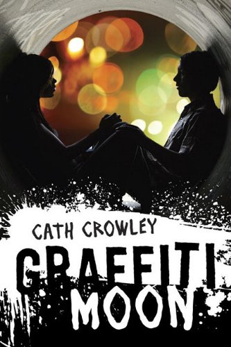
Graffiti Moon by Cath Crowley
(Knopf / Feb. 14, 2012)

Ohhh, that image. *swoons* The bokeh (sp?) effect in the background, the starkly backlit models... both contrast greatly with the graffiti-style title, a mixture of the stylish with the, well, stylish (in different ways). Plus it's by Cath Crowley, who's an incredible contemporary author, and I have the Aussie version of this book somewhere... so obviously I'm going to recommend the heck out of this book.

The Death Catchers by Jennifer Anne Kogler
(Walker Books / Aug. 16, 2011)

I appreciate an epic fantasy-esque cover with an intricate design focus and a complementarily intricate border. Not only do I think that this cover will probably catch the eyes of Rick Riordan lovers, but I also appreciate the balance in the cover's layerings, from the interesting symbol and title font in the foreground, to the silhouettes in the back.

(Farrar, Straus and Giroux / Feb. 28, 2012)

Reminiscent of Lauren Henderson's Scarlet Wakefield series and Carrie Ryan's zombie books, this cover is deceptively simplistic. The muted colors and textures actually make what colors and textures there are in the image stand out all the more, like the flash of red in her hair, or the rocks in all that milky liquid (is it water? It certainly doesn't look like it!). Droooool.

Renegade Magic (The Unlikely Adventures of Kat Stephenson, Book 2) by Stephanie Burgis
(April 3, 2012)

Look at that cover!! Isn't it so fun?? I love the colors, the whimsicalness, the detail of the background. It just brings me back to the good old Disney days. Looking at this cover, and knowing how incredible a writer Steph is (I loved the first book in the series, Kat, Incorrigible), I know I can expect pure magical adventurous goodness.

Tuesday, June 28, 2011

Cover Lust (28)

The Princess Curse by Merrie Haskell
(HarperCollins / Sept. 6, 2011)

Ooooooh so gorgeous! I love the vibrancy of the cool blues and reds, and I love that it's illustrated. Very, very, very pretty.

Wanderlove by Kirsten Hubbard
(Delacorte Books / March 13, 2012)

Kirsten Hubbard gets the cream in YA contemporary covers. The cover of Like Mandarin was awesome and this one stays along those lines, making use of white space and one strong color scheme. Wowww.

Born Wicked (The Cahill Witch Chronicles, Book 1) by Jessica Spotswood
(Putnam Juvenile / Feb. 7, 2012)

This makes my blood hum a little, I think. What lusciousness! I like that it combines the fairy/magic/witch cover art element (wilderness, light pretty dresses, flowers in her hair) with something slightly wicked and modern (the girl's stare).

Everneath by Brodi Ashton
(Balzer + Bray / Jan. 3, 2012)

So it's totally not my type of read, being a paranormal romance, but I can't help my eyes widening at the sight of that flowy dress trailing off into wisps of smoke (!!!). And that pinkish red color is to die for.

Thursday, May 19, 2011

Cover Lust (27)

Dearly, Departed by Lia Habel
(Del Ray / Dec. 6, 2011)

The purple shading, the parasol, the girl's dress and hair... all is alluring.

Thief Eyes by Janni Lee Simner
(Bluefire paperback reprint / April 5, 2011)

Oh, how I love silhouette images! Does this remind anyone of Maggie Stiefvater's paper-art book trailers? I'm not the biggest fan of the eyes in the background, but the foreground so makes up for it.

A Long, Long Sleep by Anna Sheehan
(Candlewick Press / Aug. 9, 2011)

The gradual fade, the gradual fade! Delicate yet surprisingly sultry.

Chalice by Robin McKinley
(Penguin paperback reprint / Sept. 16, 2010)

I believe this is a paperback reprint of Chalice. I like the old cover well enough, but this one is just stunning. It evokes a cross between guardian angels and statues for me, and the shot of the sky above is just so, so breathtaking.

The Scorpio Races by Maggie Stiefvater
(Scholastic Press / Oct. 18, 2011)

Isn't this cover just so incredibly classy? The rich, textured red color and the burnished gold text lend an air of class, timelessness, and intrigue to the story. WOW.

Which one of these five is your favorite? If you saw these in a bookstore would you pick them up? Let me know!

Friday, April 15, 2011

Cover Lust (26)

When one has a thesis due at the end of the month... obviously procrastinate by finding pretty covers.


Illuminated by Erica Orloff
(Speak / Dec. 8, 2011)

It's a little too goldenly cliched for me to like for a very long time... but I dunno, it mesmerizes me right now. It's just bright and shiny and whatnot.

The Space Between by Brenna Yovanoff
(Razorbill / Nov. 15, 2011)

Talk about a cover of creepy AWESOME. I like how the red skies hint at the main character Daphne's demonic background, and the way the model lies across all that steel, another characteristic of the world Daphne lives in. Wowza.

Juliet, Immortal by Stacey Jay
(Delacorte / Sept. 13, 2011)

I debated for the longest time whether or not I liked this cover. I think the verdict is I do. The muted colors add a solemn weight to the cover--even as she's sitting at the edge of the sea in a pretty dress.

Legacy by Cara Kluver
(HarlequinTeen / June 21, 2011)

I like this mostly for the font and curlicues, lol, and the sharpness of the details of the model's outfit. This will definitely appeal to the YA-reading crowd.

Fury by Elizabeth Miles
(Simon Pulse / Sept. 6, 2011)

Again: font, curlicues. The model's dress and (attempt at an) unnerving stare. The fiery red hair that trails off into wisps of smoke... or at least that's how it looks to me. Very fierce.

-

So, how do you feel about these covers? Got any you've seen lately that has gotten you lusting over it?

LinkWithin

Related Posts Plugin for WordPress, Blogger...