
Oh, and I blame whoever tweeted me the night of December 28 as the enablers of this post. Bad children, bad!
In no particular order...
1. Shade by Jeri Smith-Ready

Look, I love Jeri and her writing incredibly much, but I had to be honest with myself and say that I didn't think this cover did her writing justice. The girl wraps around the back cover... so why did they have to put the most awkward-looking part of her on the front?? Simply put, I was relieved when Simon & Schuster redid the cover for Shade's paperback:

Much better. Shoulda done it in the first place.
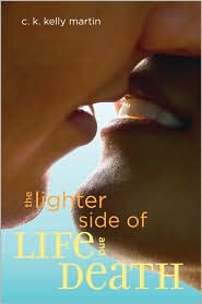
2. Before I Fall by Lauren Oliver

Oh no you didn't just put a narsty close-up of a girl's face sideways and slap a glowy title font on the front. Anyone could do this on Photoshop. In fact, I know how to make font glowy on Photoshop. My favorite part is probably the font color for Lauren and Jay's names. At least they match the girl's lips and eyes. I really want them to change the image for the paperback, whenever it comes out...but we'll see. A lot of people seem to like this cover. Hrm.
Other similar awkward-full-frontal-uncomfortable-staring covers, yays:

Gah. You know how people being interviewed on shows or documentaries almost never look straight-on into the camera? You know how they always look as if they're talking to someone just to the left or right of the camera? (Well, they probably are.) It's because full-on stares make people uncomfortable. Covers that make me uncomfortable = me staying away.
And just for kicks, here's a cover that made me so uncomfortable that I actually did cover the front while I was reading it so that my inner spineless scaredy-cat wouldn't get nightmares:
And it didn't even need a full-frontal stare with eyes to creep me out. Double gah.
3. The Snowball Effect by Holly Nicole Hoxter
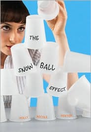
Angerrrr. So much angerrrr. (Or, should I say, angrrrr.) How could they have taken an insightful book and slapped this elementary-school computer graphics lesson's first draft on the front? YES, I'm angry. NO, I'm not lightening my stance. How many readers do you think guffawed at this cover when they saw it in stores (if they even saw it in stores, since if I were a book-buyer for a store I'd probably guffaw at this and pass it up too) and then stayed 10 feet away from it? Goddammit. I hate when good books get sucky covers.
4. The Poison Diaries by Maryrose Wood
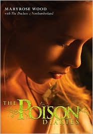
I waited on tenterhooks for this book's cover ever since I read about the deal. For some reason, any title containing the word "poison" in it evokes to me a really awesome cover (e.g. Poison Study, The Poison Throne). I was so disappointed when this cover was finally revealed, only a handful of weeks before the book came out (probably because they couldn't decide on the cover, I assume). I love the artistic intricacy of the title font. As for the rest of it? Forgive me when I stand up on my chair and yell, How could you have taken such a fascinating story premise and done...this to it?? A premise like this screams for the need to put sinister-looking plants on the cover. Instead, we get a yawn-inducing image of a girl bathing in a heat lamp. I suppose that's your plant reference right there. Oh, and maybe she has a plant tucked in her shirt but it's out of focus and thus that doesn't count as putting the plant reference in the cover.
Oh, here's some more awkward "girl looking down demurely" covers that just didn't impress me at all:

Shall we gah some more?
5. I Now Pronounce You Someone Else by Erin McCahan
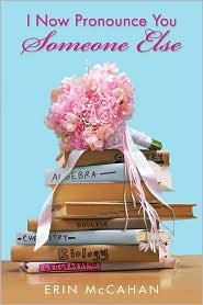
People, I weep. This upsets me. If I hadn't read a good review of this book elsewhere I would have totally ignored it...and that would have been a crying shame, since I enjoyed this book so much I went out and bought a finished copy for my collection. Look, I don't have anything against girly things. I like the sky blue background; I like hot pink in limited quantites; I'm learning to like weddings. But put them all together and completely ignore the witty and heartfelt components of this book... and you make me cry. Now, I love my well-written chick lit stories, but you wonder why they're such a hard sell, and why we can never get anyone to take them seriously? See above for Example A.
6. Not That Kind of Girl by Siobhan Vivian
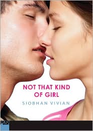
I swear that contemporary YA get the shaft in cover treatments. Maybe people think it's more okay to use generic images for contemporary fiction because, uh, photographs are contemporary? Blergh. Yet another book I initially dismissed but then was glad I didn't. *shakes fists at whoever's responsible*
Not going to elaborate, but here are two more that I think join Not That Kind of Girl's cover in the whole "generic as f***"/"awkward picture of close-up lips almost-kissing in a completely unsexy manner" #phail category:
Dude. Almost-kissing is SEXY. That's why the First Novels Club does their annual No-Kiss Blogfest. Sexual tension is SEXY. There is nothing sexier than a well-done almost-kiss. Unfortunately, these covers do not exude sexiness for me.
7. Anna and the French Kiss by Stephanie Perkins

Oh ho ho, yet more examples of good contemporary YA being shat on in the cover design department. Luckily for this book we all love it so much we can ignore the lackluster cover treatment. Look, I'd be fine if the paperback looked pretty much the same; just move the boy over so we can actually see his face! I know Etienne is swoony and all that, and that everyone's definition of swoony is different, but what's the point of keeping him hidden except for a very un-Etienne-like (at least in my opinion) shoulder, and then showing us what Anna looks like? Either put both of them on, or keep both faces off. Let's stay classy, people.
8. She's So Dead to Us by Kieran Scott
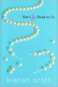
This is just um so bizarre. We know that Kieran Scott also writes under her pen name, Kate Brian. It's a fairly well-known "secret." And I can't help but compare the cover treatments that her two different sets of books, written under different names, get. "Kate Brian"'s covers are edgy, scandalous, alluring--albeit in a generic Gossip Girl-esque way. Kieran Scott's look like they were written for 9-year-olds still stuffing themselves into their kindergarten Halloween ballerina costumes even with their pudge hanging out of the leotards, who like to think they know all there is to know about middle and--gasp--high school through their heavily made-up older sisters and wannabe-21 velour-wearing mothers. (Um, did that make sense to you? Maybe it's a Jersey thing, velour couture.) It's no wonder I haven't had so much as a glimpse of She's So Dead to Us in stores this year... which is a shame, too, because it's like Gossip Girl or The A-List without all the brand name-dropping, and would be happily swooped up by readers of those series.
9. The Body Finder by Kimberly Derting

Okay, okay, I don't think this one's nearly as bad as some covers that have been published this year, but it did make me scratch my head for a good two weeks or so after I came across it. What exactly is that bright blue blobby thing? A backlit leaf or flower of sorts? A ghost! A...handmade Halloween costume gone wrong. Once you read the book you get a better idea of what I think the cover was trying to represent, but every time I look at it I still think, "Poor person stuck in that monstrosity of a handmade Halloween costume!" (Why do I think that, anyway? Does that look like a Halloween costume to you, or am I just going crazy?)
-
You know, I think these #phail occurrences would decrease in number if it were mandatory for the art directors and cover designers to read the book before they create the cover. You can consider it part of the job or something, get paid for the reading time.
Okay, I feel bad for ragging on designers of contemporary YA book covers. I don't wish voodoo on you, I swear! I still acknowledge your rightful existence as a human being and your creative freedom! Anyway, to end on a higher note, here are some covers for contemporary YA that I DO like:


See? I am appreciative of art.
[Disclaimer: Please please please do not take this post the wrong way. I am not making personal attacks on any individuals or groups. I am simply expressing my opinion as a subjective consumer of YA books and a totally amateur observer of art.]
Okay, I'd love for you to chime in at this point! What were some of your WTF Covers of 2010? Let's just take this day and indulge in a little end-of-year ranting... or something like that.
I agree with the I Now Pronounce You Someone Else and think that the PB version of Shade is much better than the HC.
ReplyDeletetotally understand by what you by the contemps covers and totally agree I want to see st. Clair on the cover too.
ReplyDeleteAll right. I love this post. I may or may not have been (perhaps maybe definitely) one of the enablers.
ReplyDeleteHere's a list of things I love about this post:
1. Steph-kitty growls.
2. "Narsty."
3. Every single word you saig about uncomfortable full-frontal stares. And I agree, people should always have eyes on book covers.
4. The Body Finder cover. I thought it was some weird variation of "wacky waving inflatable arm-flailing tube man" from Family Guy. Haha!
Great post, Steph! I did like some of the covers that caused some ANGRRR for you, but I can absolutely see your points on each cover! (Especially Jeri's books. Have you seen the cover for Shift? Facepalm. SHE IS AMAZING AND DESERVE COVERS THAT HAVE LIGHTS AND LASERS AND SUCH!)
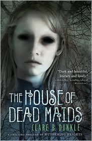
I love this post! I completely agree about the House of Dead Maids cover. It's so creepy. Imagine falling asleep with your book and waking up to that face. EEP!
ReplyDeleteThe Before I Fall and Anna and the French Kiss covers don't do the books justice. I feel like people will immediately dismiss them just because of the cover, and that's just tragic. Those books are amazing.
Oh, and I also agree about the covers you love. They're some of mine as well. :)
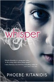
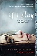
I agree with you here, mostly! I actually quite like the Whisper cover! Of course, I haven't read it, so I don't know that that's actually relevant. And I HATE the new If I Stay cover. HATE IT. I really *really* liked the original cover and I think the new one is so generic and just downright ugly. This post is hilarious, I love it :)
ReplyDeleteI agree with most of what you said here! Some of these covers are so yawn inducing. Another cover that bugs me is Slice of Cherry by Dia Reeves. It grosses me out for one, and doesn't show how dark the story really is.
ReplyDeleteI totally appreciate your honesty! I hate when book reviewers swoon over something that is totally NOT swoon-worthy. It's ok to dislike a cover & still love the book people!
ReplyDelete"Steph-kitty growls." is one of my new favorite sayings, as it totally fits in with this post.
ReplyDeleteI didn't think Shade was THAT horrible, but the image is kind of blurry and the ribbon is hopelessly awkward.
From the ARCs of 2011, we seem to be moving from 'girl's face looking straight/down at the camera' to 'girl standing in an impossibly and unnaturally complicated dress she probably doesn't wear in the book.'
The good thing about this upcoming trend is that it's pretty couture as opposed to making me want to barf (although the Siren cover is more haunting to me than face barf).
The House of Dead Maids fits the book well, I think. Totally *(^$#@! messed up in a quiet way.
I Now Pronounce You Someone Else got SUCH a bad job. *cries* I loved the book, but until I got the copy I thought it was a small press's attempt at photography. When I realize Scholastic did it, I was depressed. Ditto with Kieran Scott. Have you seen her cover for Geek Magnet? It's worse, if possible.
I think you're spot on with all of these Steph. Many of them don't just off the shelf and none of them made me swoon.
ReplyDeleteFor huge book nerd, swooning over a cover is half the fun of buying a new book.
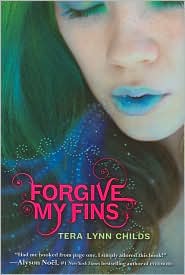
hahahah SO true, Steph. I hated the covers for Forgive my Fins and Claire de Lune. Frankly, I want to see covers that step out of the bounds, and I don't see that in most of these.
ReplyDeletePS...still confused about The Body Finder cover.
Great post! I rate covers/titles together as a seperate thing on my reviews.
ReplyDeleteI completely abhor The Body Finder cover. It's horrible. I didn't know what it was either. Of course it looks like a flower but everytime I look at it I see a feather duster! And after reading the book I still don't understand the cover image. Geesh! And they're keeping this format for the next book too! Gah!
Favorite post! I so agree with you. And the sad thing is some of those covers make you not want to read the book.
ReplyDeleteWhen I saw the cover of She's So Dead to Us I promise myself I would NEVER read such book, but after reading it I realized it was not what I expect it & my former dislike had all been the cover's fault! And I ended up loving the book.
I think they should be more careful because covers are very important, it can sway a reader from buying or not the book.
You picked some great WTFers! And I'm totally with you: that does *not* look like Etienne's shoulder to me, either. And that doesn't really look like Anna. I really don't like how so many YA books consist of a close up on a girl looking mysterious or fragile. Covers for contemporary books need to be seriously reconsidered. There are some great ones, but in general they could be so much better.
ReplyDeleteI'm glad to take some of the enabling blame! BRING IT.
ReplyDeleteThat House of Dead Maids cover! I saw that on your Goodreads feed one day and completely freaked out! You were the inspiration behind me posting it for my What Were YA Thinkin? feature, in case you never knew that. =)
I agree wholeheartedly that a cover's fugly face often does no justice to its pretty innards. And I totally loved this post, of course! =)
I enjoy snarky Steph.
ReplyDeleteI still think the arm on the Shade hardcover is a leg every time I see it. Ag.
POOR ANNA D:
i really love the cover for i now pronounce you someone else (and I actually bought the book for its cover) but you're right (now that i've actually read it) that it doesn't do the book justice.
ReplyDeleteand i agree with what you said about contemporary covers, many could use some work.
Most of those covers I don't love or hate, I'm just indifferent to. The Lauren Oliver caught my attention, but it is almost identical to an old Jodi Picoult cover - I think Mercy. And that Dead Maids cover - urghhh! That is horrible.
ReplyDeleteThe cover I hated most was the UK paperback of "The Replacement." The hardback is brilliant - creepy but intriguing, with a baby's pram under a creepy tree with a creepy mobile hanging from it. The new cover is a photo of a really generic-looking boy against a backdrop that has already been used (if not the same one, almost identical) for Lauren Kate's Fallen. What a let-down!
Definitely The Snowball Effect and Anna and the French Kiss. Eurgh!
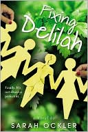
ReplyDeleteI also don't like Siren, Please Ignore Vera Dietz, Fixing Delilah, Personal Demons, and I could go on and on.
Nice post ;)
The PB version of Shade is definitely much better and I hope they change the cover for Before I Fall I really do not like the cover. But I gotta say I think the creepy stare directly at the camera suit Whisper, Sirens and House of Maids (though I am staying away from that last book too creepy for me).
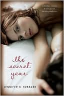
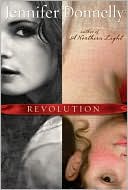
ReplyDeleteI like a lot of your choices for the books you DO like except for perhaps the first The Sky is Everywhere and The Secret Year as well as Revolution, I much prefer the UK cover.
Covers I really did not like this year were the PB version of Silver Phoenix ( I hated that they changed it from the HC and not for the better) and Forgive My Fins. It could be the colours but I just hate it.
This post is so funny. To be honest I quite liked some of these, but what your choices have made me realise is that a poor choice of font can be *really* offensive to the eye. I mean, a few of these look really cheap, and that's a real pity.
ReplyDeleteThat said, I like the cover of Anna and the French Kiss. I haven't read the book yet though, so maybe if I had I'd feel a little more protective of it.
Oh my gosh! I agree with you on every single one of these. Honestly. I didn't get why so many people loved the cover for Before I Fall. And the cover for Anna was what made me ignore it when I saw it all over the blogosphere. I gave that extra copy that I bought at the Dtown Bookstore and gave it to my little sis for Christmas and I told her not to judge it on the cover because I've heard wonderful things. She said, "GOOD! The cover makes it look lame."
ReplyDeleteI loved this post!!
ReplyDeleteSo right all the things you said!
Also, confession time. Part of me sort of thought that the "shoulder" in Anna and the French Kiss was sort of Anna's shoulder, like they had just cut it and pasted it on the other side, then I looked closer and realized it is a man's hand.
:P The cover is very off putting though.
Oh this just so cracked me up - put it in the roundup for sure!
ReplyDeleteYour analysis of these books is pretty much dead on! You crack me up... Those kissing books were quite awkward looking... The only one I disagree with is The Body Finder. I really love that cover even though, now that I think about it, it DOESN'T make a lot of sense.
ReplyDeleteGreat post, I can see why you won all those Best Written Blog awards!
ReplyDeleteForgive this random question, but I'm dying to know: what movie is the left picture from your banner from? I could have sworn Whisper of the Heart, but I don't remember the main characters ever wearing those clothes.
This is perhaps the coolest and funniest post holding such truth that I've ever seen on a book blog! I completely love this!
ReplyDeleteI've always thought that the cover of Shade is awkward, but until reading this, I had no idea that the rest of the girl is on the back! You're right, they should have done that in the first place! :)
I've never really disliked the cover of Before I Fall... But what you said made me laugh!
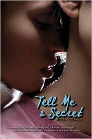
I agreed with you on all of these, except The Body Finder (but I still don't know what that thing is) and I didn't think Tell Me a Secret was too bad.
No matter what, I can always count on you to make me laugh. I totally agree with you on this post! the cover for Before I Fall does not do it any justice at all! I also get the almost-kissing-made-not-sexy!
ReplyDeleteha, that was a whole lot of ha going on =D anyway, yeah I agree, there are some covers that you think, why! why did they do that but yeah, can understand. Pretty awesome Read!!
ReplyDeleteNow a follower ;)
Jess :)
http://sheknownasjess.blogspot.com/
LOL! Love this post!
ReplyDeleteI totally agree with you about the Shade cover!!!!!! If I didn't read the good reviews about this book, I seriously wouldn't have a second look at it! I'm sorry but I do sort of judge books by their cover :(
And that Snowball Effect cover. If I didn't read this post of yours, I wouldn't have heard of it nor even glance at it! Thanks for this awesome post!!! :) Got to pencil in more books on my wish list now. Happy New Year!
The house of the death maids cover is creepy! I think that Anna and the French kiss cover is not great either but it's not in my WTF list
ReplyDeleteOMG- this post just made my entire night. I completely agree about BEFORE I FALL's cover....I completely ignored the book for so long simply because I thought the cover with weird to the nth degree. I wanted nothing to do with the book. And I finally read amazing reviews, picked it up and LOVED IT.
ReplyDeleteNever thought about how awkward the ANNA cover is, but def. see it now.
I don't mind the I NOW PRONOUNCE YOU cover too much...It's got a lot going on..might have been nice to see some faces though.
Again, awesome post!
1 100% agree with you
ReplyDeleteHaha, can I just say your post made me laugh insanely hard?! xD I do agree with you on a few of these.
ReplyDelete~Alison
This comment has been removed by the author.
ReplyDeleteSO glad you put this out there, tbh. the 'before i fall' cover i the most ridic thing i've ever seen in relation to the actual story! i didn't get it at all, and it was bizarre to boot.
ReplyDeletei love love love the snarkyness of this post. well done, lady!
Steph, this post made me so happy. I cannot even begin to express how much I loved this post! Ha!
ReplyDeleteI will tell you this: The cover AND title for Anna and the French Kiss has turned me off of the book entirely. I know every one is raving about it but due to cover and title I have already given up on it.
When I was sent She's So Dead To Us for review I was curious about the cover, torn even, on whether or not I liked it. After reading the book and enjoying it immensely, I sort of like the simplicity of the cover. I don't love it to pieces, but I just like how simple it is.
Thank you for writing this post because I love you.
I totally agree with most of these covers. Although... I do like the Before I Fall cover.
ReplyDeleteI have issues with Forgive My Fins, I really don't like it at all.
And now that I've read Anna and the French Kiss, I really don't like the cover! I also don't like that they're both wearing a white shirt, at 1st glance I didn't realize that was supposed to be a boy. And we don't see the stripe in her hair, which was mentioned a gazillion times. Also, I find the title to be too cutesy for the book. BUT the book itself was amazing!
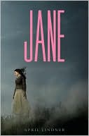
I LOVE the cover of April Lindner's JANE. So simple yet so beautiful. I'm dying to read Anna and the French Kiss, but not because of the cover - I've been to Paris and there is no place where you could sit on a bench and have the Eiffel Tower in the background like that. Bugs me a lot!
ReplyDeleteHere are my opinions because I know you care about them SO much:
ReplyDeleteI agree with you about the "Shade" cover--I didn't even notice the arm at first; I thought the cover was just a bunch of abstract shapes.
However, I liked the "Before I Fall" cover! It's colorful and iconic and pops out at you from the shelf, that's what I like. The "Siren" cover is just awful though.
"The Snowball Effect" = horrible.
"The Poison Diaries" = decidedly meh. I mean, I'm just getting sick of the whole "girl's face in 3/4 profile" IN GENERAL, not just on covers that have a much more interesting book in them.
The "I Now Pronounce You Someone Else" cover doesn't seem too bad to me, but I haven't read the book, so maybe it doesn't do it justice like you say.
I agree with you about "Not That Kind of Girl." I never would have picked that one up if my YA librarian hadn't highly recommended it.
I wasn't bothered by the "Anna and the French Kiss" cover until you pointed out that one of their faces is shown and not the other. Now that's going to bug me forever!
"She's So Dead to Us" = blerg? I would never pick that book up based on the cover.
"The Body Finder" = didn't bother me, but again, it looks like so many other books that are out right now with ABSTRACT COLORED SHAPE on BLACK BACKGROUND.
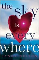
Your covers that you liked are interesting, because I strongly agree with you on some and strongly disagree on others. I don't like either of the "The Sky Is Everywhere" covers. The first one looks too photoshoppy and the second one is too cluttered. I love the "Jane" cover. Could go either way on "The Secret Year" covers. The border on the second one is abhorrent to me for some reson though.
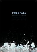
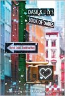
I like "Freefall" and the "If I Stay" pb, and the "Dash and Lily" covers. The others I don't really care about. I like stuff that really grabs you, like the huge pink letters on JANE or the negative space on "Freefall." Clutter up a book cover too much and you lose me right away.
My favorite covers this year are The Replacement, Wolves, Boys, and Other Things That Might Kill Me (a title construction that I hate, btw), and for some reason I really like the one for Deadly Little Games.
Least favorite for this year: Probably Sorta Like a Rock Star. I got so many recommendations that it was fantastic, but the garish cover kept me from picking it up for a long time.
This comment has been removed by the author.
ReplyDeleteAck, sorry if you get my comment a bunch of times! For some reason Google kept telling me it hadn't posted.
ReplyDelete