

Rose Sees Red by Cecil Castellucci
(Scholastic / Aug. 1, 2010)
How cool is this? I love the silhouette look, the outline of the NYC skyline, the sparse but carefully used splashes of red. This is the kind of cover I'd love to have as a giant poster to hang up on my wall.

Sisters Red by Jackson Pearce
(Little, Brown / June 7, 2010)
I really, really, really, really hate the cover for Jackson's first (and awesome) book, As You Wish. I'll make no secret of it. So when I first saw the cover for her second book, I think I screamed. It was just so utterly unique, SO different from the first cover (thankfully)...so different from everything I had ever seen, really, that it is perfect. I love the slight mirroring effect between the human faces, and I didn't even notice until now that there's a WOLF at the bottom!! This is brilliant brilliant brilliant and is the type of modern art that I so wish I had the talent for. I'm so happy Jackson got such an amazing cover.

The Dust of 100 Dogs by A.S. King
(Flux / Feb. 1, 2010)
This one came out last year, but it's similarly awesome, still one of the most striking and original YA covers out there. At first all you see is the skull, the almost glaring contrast of black and white. Then, you begin to notice the incredible intricacy that is the silhouette of the girl holding the ship in her lap. Awesome!
-
Do you know any similarly colored or silhouetted covers that you like? Feel free to leave a link in the comments below; I'd love to check them out!
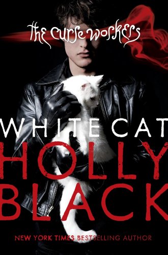
ETA: Might as well add the cover for White Cat by Holly Black (Margaret K. McElderry / May 4, 2010). It's not the same silhouette as the above three, but also has the red/white/black color combination, and is seriously KICKASS. The lighting over the leather jacket, the stark, graphic novel-like shadows from one side of the model to the other, the simple yet striking title and author font that stretches across the entirety of the cover. I bow down to its maker.
The Dust of 100 Dogs was a fun read!
ReplyDeleteLove all the different red, white, and black covers
According to this comment, Cassel (the boy on the cover of WHITE CAT) is supposed to be brown-skinned, not white. http://thebooksmugglers.com/2010/02/cover-matters-on-whitewashing.html#comment-18238
ReplyDeleteI love seeing a grouping of books that have the same color schemes - its just cool! Love the cover for Rose Sees Red - so simple.
ReplyDeleteomg I did NOT notice that about Sisters Red. SO COOL. It's like Shiver's cover all over again. Wolves are the best, clearly.
ReplyDelete@anon,
that's worrying. Thank you for linking.
I LOVE the cover for white Cat. It's amazing. Except for the fact that it may be whitewashed. boo.
ReplyDeleteThe re these covers are cool too. The whole red, white and black silhouttes make awesome covers clearly :)
I LOVE the Sister's Red cover. When I first saw it I had to do a double take because it was SO MUCH BETTER and FAR MORE UNIQUE then the cover for As You Wish. I'm happy too that Jackson Pearce got this gorgeous cover for her second book because she deserves it.
ReplyDeleteThe first silhouette that comes to mind is the cover for Shiver even though its blue and white its gorgeous.
As for black, red and white covers I can think of a few like The Child Thief and Feed but these aren't silhouettes.
I love all of them, as red, white & black is my favourite mix of colours. I think the White Cat cover is my favourite though!
ReplyDeleteSuppose I can guess your fave colours on the cover - red, black and white? :)
ReplyDeleteI love the red/black/white color scheme, so long as the covers don't look like a bunch of Twilight wannabes. These are all beautiful and very eye-catching. I'm getting a little sick of the covers with models, and I'm always drawn to modern art. Way to go, Jackson! Worlds better than As You Wish.
ReplyDeleteI love all of these covers! I especially like the first one, I'd never seen it before!
ReplyDeleteI'm pathetic. I never even noticed the wolf at the bottom of the Sisters Red cover. Love the cover even more now though!
ReplyDeleteGreat post!